Logo
A simple logomark typeset in Parabole Display; a typeface that’s heavily related to penplotter aesthetics.
Color
Using a minimalist off-black-and-white color scheme turns the brand into a container for the more vivid and interesting color schemes brought by the quadtree-processed images.
Typography
The heavy lifting is done by the Waldenburg family. Its neutral character and range of weights and widths make it the perfect workhorse typeface, allowing it to work across bold headlines as well as information dense slide decks.
Photography
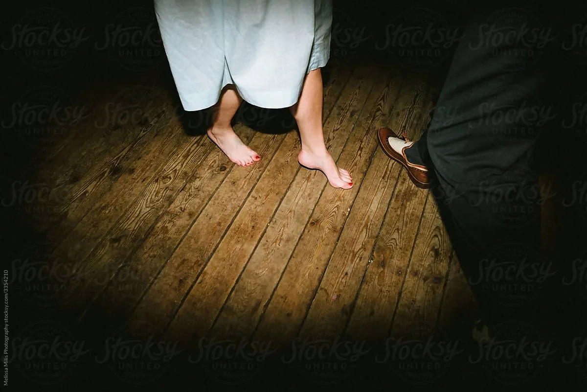
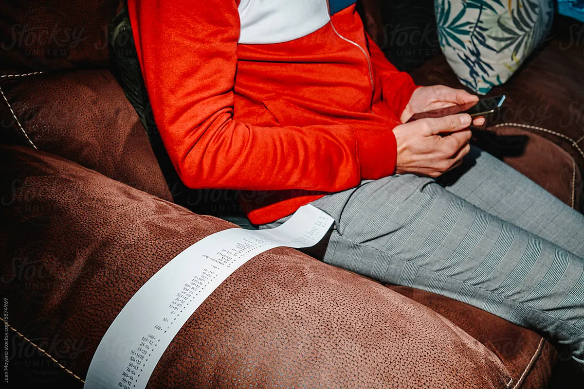
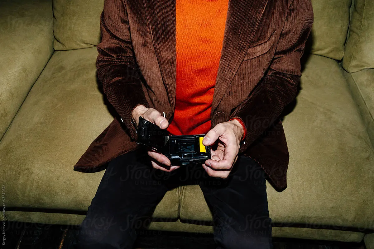
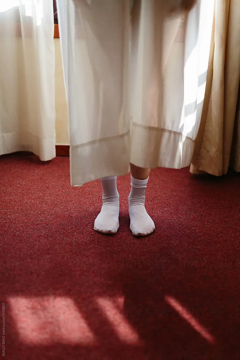
Our imagery is drawn from carefully selected, publicly available photographs with a deeply personal and ethnographic quality.
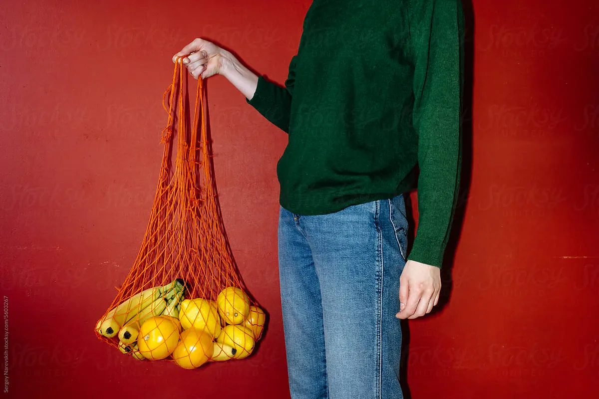
The style is colorful, bold, and intimate - revealing the details of everyday life. We look for rich contrasts in color and a rhythm between calm and detail-heavy areas, creating both visual impact and technical harmony with our system.
The photographs feel candid: raw, quotidian, sometimes grainy or direct-flash. Cropping often emphasizes the situation more than the face, keeping the focus on lived experience rather than polished portraiture.


